Most companies treat brand and office design as two separate line items: marketing signs off on the logo and the colour palette, and facilities signs off on the floor plan. Nobody in the room owns the fact that the two are the same decision. A visitor, a candidate or a new hire reads a company's culture off the room before anyone has said a word, and most of what they read was never chosen on purpose — it was whatever the base building shell happened to come with, or whatever the cheapest available finish was at the time budgets were signed off.
This matters more than it used to. Offices used to be judged mainly on cost per square foot and location. Today, with hybrid work making the office optional for many employees on any given day, and with candidates comparing offer letters that increasingly include a photo of the workspace, the office itself has become a recruiting tool, a client-facing asset and a daily piece of internal communication, whether a company plans it that way or not. Getting it wrong is not a design failure so much as a missed opportunity to say something true about the company, for free, to everyone who walks in.
It isn't the logo on the wall
The signal isn't the branded wall graphic near reception. It's the material behind it. A laminate reception counter and a stone one say different things about how a company sees itself, regardless of what the pitch deck says. The same goes for less obvious choices: whether leadership sits behind a closed door at the end of a corridor or at a desk on the same floor as everyone else, whether the pantry is an afterthought squeezed into a leftover corner or a space someone actually designed, whether meeting rooms are visible through glass or hidden entirely, and whether the first thing a visitor sees after the lift doors open is a wall of file cabinets or something someone actually planned.
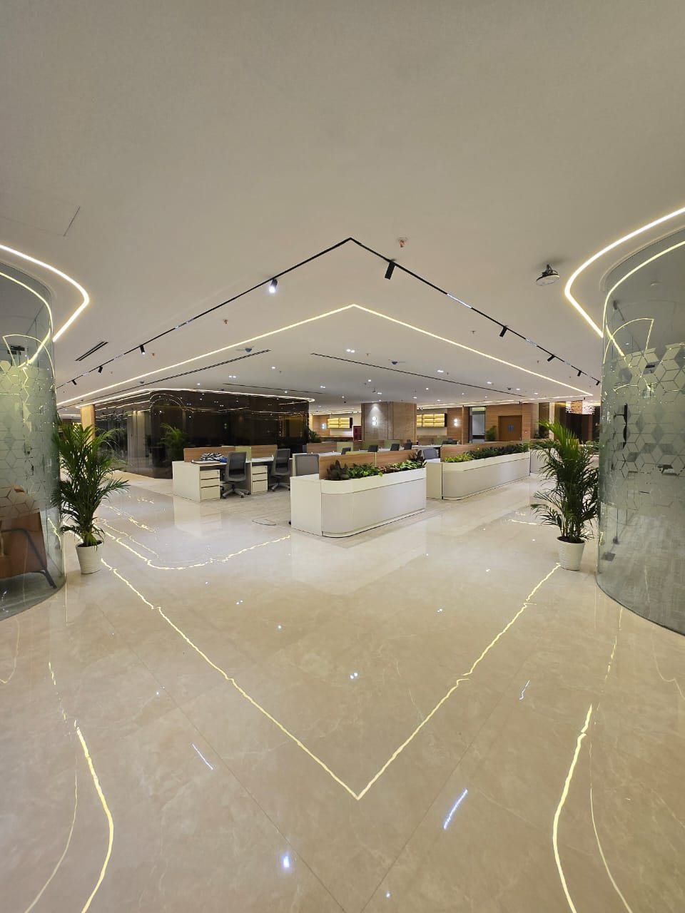
Colour and material choices carry this weight before anyone reads a word of signage. A palette built around warm timber and soft textiles reads as approachable and people-first. Exposed structure, concrete and glass read as technical and fast-moving. Marble, brass and dark wood read as established and premium. None of these is right or wrong on its own — the mistake is picking a palette because it looked good in a moodboard rather than because it matches what the company is actually trying to say about itself. A ten-year-old manufacturing business and a two-year-old fintech should not default to the same finish palette just because both hired the same contractor.
None of this needs a large budget to get right. It needs someone to decide, early, what the company wants a visitor to feel between the lift and the first handshake, and to make finish and layout choices that actually deliver that, rather than defaulting to whatever is fastest to source.
Where brand intent usually breaks down
In practice, brand intent gets lost at three predictable points, and all three are avoidable with the right process rather than a bigger budget.
- The brief never gets written down. "Make it feel premium but approachable" is a sentence, not a brief. Without a short, specific description of the company's culture, its client-facing needs and its non-negotiables, every downstream decision — the designer's, the contractor's, the vendor's — is a guess.
- Budget pressure flattens the plan evenly. When costs need to come down, the easiest move is to trim finishes uniformly across the whole floor. This is almost always the wrong cut. A floor with one genuinely considered space — usually reception or the main meeting room — and an efficient standard everywhere else reads far better than a floor where everything was trimmed by the same 15%.
- Design and execution are handled by different teams with different incentives. A designer who never has to build what they draw can specify materials that are difficult or expensive to install correctly. A contractor who never had a hand in the design has no reason to protect the intent behind a detail when a cheaper substitute is available on site. The brand-level decisions made in a mood board are exactly the ones most likely to get quietly substituted during construction unless the same team is accountable for both.
The decisions employees notice, not just visitors
Employees read the same signals daily, at a level visitors never see. Seating density is one of the clearest examples: a business that talks about flexibility but assigns every seat, or one that says it values collaboration but has no informal space to actually have a conversation, is telling its own team something different from what it says in an all-hands. Hybrid attendance has made this sharper rather than softer — a floor planned for five days a week of full attendance, now running at sixty or seventy percent on a typical day, either sits half-empty in a way that feels deflating, or gets right-sized in a way that has to account for peak days without over-building for them.
Getting the ratio between focus space, meeting rooms and informal areas right is as much a culture decision as a real estate one — our fit-out cost calculator and a practical read on sizing an office around attendance, not headcount are both useful starting points before that ratio gets fixed in a lease. Acoustic comfort belongs in the same conversation: open-plan layouts that look impressive in a walkthrough photo but make every call audible three desks away are a daily source of quiet frustration, and frustration compounds faster than any wall graphic can offset it. Natural light, a genuine breakout space rather than two beanbags in a corner, and enough small meeting rooms that people aren't taking calls in the pantry are not indulgences. They are the difference between an office people choose to come into and one they tolerate.
A practical way to think about it, zone by zone
Rather than trying to apply a brand statement uniformly across a whole floor, it helps to treat each zone as its own small decision, with its own budget share and its own job to do.
Reception and the first sixty seconds
Reception carries a disproportionate share of the brand signal for a disproportionately small share of the floor. It is worth spending more per square foot here than anywhere else on the floor, because it is the one space every visitor, candidate and vendor experiences regardless of why they came in. We've written separately about why reception design shapes a visitor's whole impression — the short version is that lighting, one deliberate material choice and a clear sightline to where the visitor is headed next matter more than square footage.
Workstations and meeting rooms
This is the largest area by square footage and the one employees interact with the most. The brand decision here is less about finish and more about honesty: does the layout match how the company says it works? Assigned desks in a company that markets itself as flexible, or a scarcity of meeting rooms in a company that says it values collaboration, undercuts the message faster than any finish choice reinforces it.
Leadership areas
How leadership space is treated relative to everyone else's is one of the most-read signals in the building, and one of the least discussed in a design brief. A closed corridor of cabins at one end of the floor, visually separated from the rest of the team, reads a specific way regardless of what the culture deck says about flat hierarchies. This isn't an argument that leadership should never have a private office — it's an argument that the decision should be made deliberately, matched to how the company actually wants to be seen, rather than defaulted to because that's what the last office had.
Pantry, breakout and informal space
These are usually the first areas to lose budget when costs are tightened, and the first areas employees mention when asked what they'd change. A pantry treated as a real space, not a leftover corner, does a disproportionate amount of work for team morale relative to its cost.
Wayfinding and signage
Consistent typography, colour cues and simple, clear signage across a floor or a campus reinforce identity every time someone walks between areas. This is a small line item that is frequently skipped entirely, leaving a beautifully finished office with hand-written signs taped to doors within the first month of occupancy.
Planning a project like this? Officea Design & Build will prepare a costed proposal for your office, free of charge.
What it actually costs to get right
Brand-level finishes don't have to mean brand-level spend across the whole floor. The pattern that works in practice is uneven: spend more per square foot in the few areas people actually notice — reception, the main meeting room, the route between them — and hold a more efficient standard everywhere else. Our 2026 city-by-city cost benchmarks break down what basic, mid-spec and premium finish levels actually cost in India right now, and the calculator on this site will give you an indicative number in under a minute once you know roughly what tier you're planning for.
Once this information is in hand, the next practical step is usually a test-fit — putting your actual numbers onto the real floor plate you're considering, before anything is signed.
As a rough guide, the jump from a basic to a mid-spec finish level buys you materials that hold up to daily wear without looking corporate-generic, and the jump from mid-spec to premium buys you the kind of reception counter, boardroom table or feature wall that a client actually remembers. Very few companies need every square foot at the top tier. Most need one or two zones at the top tier and a solid, consistent standard everywhere else — which is a budgeting conversation worth having with a design partner before a lease is signed, not after.
How this actually gets built
A brand-led fit-out is not a separate process bolted onto a normal one. It's the same delivery process, with the brief treated as seriously as the drawings.
- Brief and site study. Headcount, attendance patterns, department adjacencies and the company's own description of how it wants to be experienced all get captured before any layout is drawn, alongside a technical read of the building's structure, services capacity and any local approval requirements.
- Space planning and test-fit. The brief becomes a block plan: how much of the floor goes to focus space, collaboration space, meeting rooms, leadership areas and support functions, tested against the actual floor plate rather than a generic template.
- Design development. Materials, lighting, furniture and the finish tiering by zone get specified together, so the reception budget and the general floor budget are a single, coherent plan rather than two separate decisions made by two separate people.
- MEP and site coordination. Electrical, HVAC, fire safety and low-voltage systems are engineered alongside the interior, so a beautiful ceiling design and the sprinkler layout are resolved together rather than in conflict once construction starts.
- Construction and handover. Site execution follows the same drawings the design team produced, with the design intent protected because the same firm is accountable for both, followed by a proper handover of drawings, warranties and manuals.
The value of running all five steps under one team is that the brand decisions made in step one are still visible in step five. Split across a designer, a separate contractor and several vendors, that thread breaks somewhere in the middle almost every time.
Keeping it consistent past the first office
Brand identity in a single office is a design problem. Brand identity across a second, third or fifth city is a delivery problem, and it's the one most companies underestimate. Every additional office run by a different local contractor is another chance for the material palette to drift, the finish quality to vary, and the space to end up looking like a different company took the lease. A reception counter specified in one city becomes "something similar, whatever the local vendor has" in the next, and by the third or fourth city, a visitor moving between offices could reasonably wonder if they're dealing with the same organisation.
This is exactly why we build under a single design and build contract rather than handing each city to whichever local vendor happens to be available — the same specifications, the same accountable team and, if you want it, the same team still running the space after handover, so city three still looks and feels like city one. Consistency here isn't only about matching finishes on a drawing. It's about someone still being accountable for the space a year after handover, when a vendor needs replacing, a wall needs repainting to the original specification, or a new floor needs adding to match what already exists.
Common questions
Does brand-led design cost more than a standard fit-out?
Not necessarily more overall, but it does mean spending unevenly on purpose rather than evenly by default. Concentrating budget in reception and one or two other visible zones, while holding an efficient standard elsewhere, usually costs about the same as spreading the same total evenly across a floor — it just reads far better.
How early should brand be part of the design conversation?
Before the first layout is drawn. A palette or a zoning decision retrofitted onto a design that's already progressing is always a compromise on both sides.
What if our brand guidelines only cover digital and marketing use, not physical space?
This is common, and it's fine. The useful output of a first design conversation is usually a short, written description of how the company wants to be experienced in person — formal or informal, quiet or energetic, hierarchical or flat — which a design team can then translate into material, layout and lighting decisions, without needing a physical-space brand guideline to already exist.
Can an existing office be adjusted without a full renovation?
Often, yes. Reception, signage and one or two key zones can usually be upgraded on their own, and this is frequently the highest-value first step for a company that isn't ready for a full fit-out but wants the first-impression problem solved.
Officea Design & Build treats the finish palette, the reception sequence and the seating ratio as brand decisions from the first site visit, not corrections after the fact. If you're planning an office, a renovation or a second city and want the space to actually say what the company means, tell us about the project and we'll put together a proposal.
Planning an office project?
Officea Design & Build plans, designs and builds corporate offices across India under one contract. See our work or the full list of design and build services, or tell us your city, approximate area and target move-in date below and we'll prepare a costed proposal.